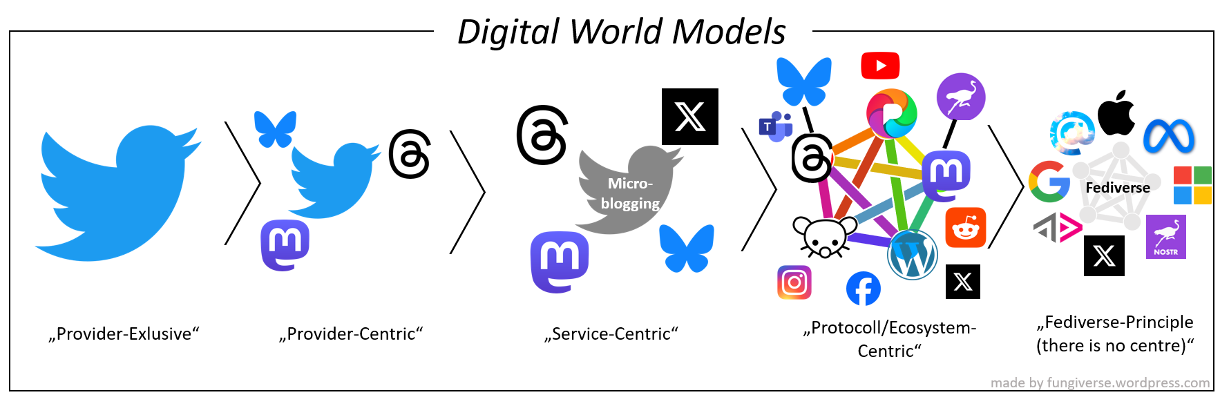
Provider-Exclusive: “There is only the app of my provider.”
Provider-Centric: “There exist other apps, but the one I’m using is the main one.”
Service-Centric: “There is no main one and I’m trying to use the one that fits my ideal the best.”
Protocol/Ecosystem-Centric: “There exist other protocols/ecosystems, but mine is the main one.”
Fediverse-Principle: “There is no main one and I’m trying to use the one that fits my idea of an open ecosystem the best.”
Current state of different web2 apps:

You can already see how Meta will also use imagery to establish its centre-position in the Fediverse with its symbol for the Fediverse (it has a centre):

(from https://mastodon.social/@liaizon@wake.st/112139602260820054)
The two nodes are Facebook and Instagram constantly circling the drain of internet culture.
Fair point
Not really. The fediverse is so diverse and spread out, not even before the Muskalypse at Twitter could anyone really agree om anything. The “node federation” logo that we’re discussing is still formally a “proposal” 😆
Yet here it still is, it’s not changed although Meta or whoever tries to rebrand with their dumb orbital design.
Yeah, I’m no graphic designer but the fediverse logo looks like a nightmare to render at small sizes, which is what designers are looking for in a logo, typically - something that is easy to recognize, tells something about the product, and scales well at all sizes, from favicon to building sized ad. I like that it conveys its own meaning really well, but it’s also extremely busy. So many crossing lines in such a small space just looks like a garbled mess at small sizes. Take this image and scale it down to 16x16px, you can see what I mean.