
Far and away the 90s and it’s not even close. We had the internet but it wasn’t stalking us. We had cell phones but your parents couldn’t drop a tracker app on it to see if you were actually at Doug’s house. Gas was cheap. Airports were better, flying was better, fewer people, god I miss the 90s.
I think they’re talking about the designs, not the whole decade.
Boy did I miss that by a mile.
Yeah but you’re right.
You’re still right. You forgot just deciding to rent a place out downtown with your girlfriend on a whim. How life is supposed to be.
It’s an interesting idea, though, that one’s preference for a particular design or aesthetic, especially when that design or aesthetic is emblematic of a particular historical or cultural moment, is never wholly isolated to its visual or material components, but also innately tied to our memory and understanding of that moment. I personally don’t think you can extricate a particular aesthetic from the psychic background noise surrounding it. Our minds don’t work that way. It’s always forming these subconscious or unconscious connections, binding events and memory to abstract signifiers.
We don’t like the 90s aesthetic because it’s “better” or even attractive. I mean, nobody has wallpaper in their home with those pastel and neon triangles. Many of us like it because it reminds us of childhood, of not having responsibilities other than waking up early enough on Saturday to catch all your cartoons and of not complaining too much when you have to go visit your grandparents who can never remember your birthday and who always ask you how old you are this year, of finishing Super Mario on the SNES before your friend does so you can brag about being better at video games than him. It’s of a simpler time and place, because we were simpler. And it was, in retrospect, of an America briefly sandwiched between the end of the original “Forever War” that was the Cold War, and the beginning of the 20th Century’s new “Forever War,” that is the War on Terror.
Give me the 90s with today’s safety standards (for things like car/aircraft/etc)
Don’t forget about the banning of indoor smoking in public places. God the 90’s were a horrible time for that although it was winding down.
It wasn’t so great if you were gay, either. Racism was mostly passe, but everyone thought Columbus was a cool guy and the natives disappeared on their own, which is not ideal.
Not being poor and the blissful delusion that history is over sound lit, but there are some hard edges to the era I hear about occasionally, as a Zoomer. And WTF is up with that song about rubbing your boner on people?
I was fortunate to have grown up in the pacific northwest where being gay was mostly fine, racism was mostly absent and we learned about smallpox blankets in school.
Dope. I grew up in a rural area where even in the 2000’s homophobia lingered pretty good. I could be wrong about Columbus in the 90s, I guess, but he was definitely a hero at some point.
I grew up pretty rural as well but in a very liberal state and since course standards were set at the state government level, the education definitely leaned that way. I think Columbus is still celebrated in certain parts of this country where they refuse to acknowledge indigenous people’s day.
Can I get a link to the dick-rubbing song?
It’s subtle, so really listen to the lyrics
Edit: Actually, think it’s too close
Yep, Too Close.
It was in Leave the World Behind, and if the characters weren’t taking it seriously I 100% would have thought it was a parody song.
Here is an alternative Piped link(s):
It’s subtle, so really listen to the lyrics
Piped is a privacy-respecting open-source alternative frontend to YouTube.
I’m open-source; check me out at GitHub.
Yep, the other guy’s got it, it’s Too Close.
Amazing time for music as well.
and real original movies. and tv shows with writing. and music videos. and exciting new progress in video games. and cheap live music. and thongs under low rise jeans.
Then the 80s show up and takes your lunch money, by blinding you with our awesome fluorescent clothing
Ha!
That, and internet in the late 90s started to get really fast. Some blokes sat in their rooms for days on end, downloading music or movies, as there were no laws against it yet. Or at least they were not enforced. In other words, those were the days when average Joe could still be one step ahead of The Man. You know, before he turned against us with a vengeance, everywhere, 24/7.
deleted by creator
Disappointing lack of chrome spray colour
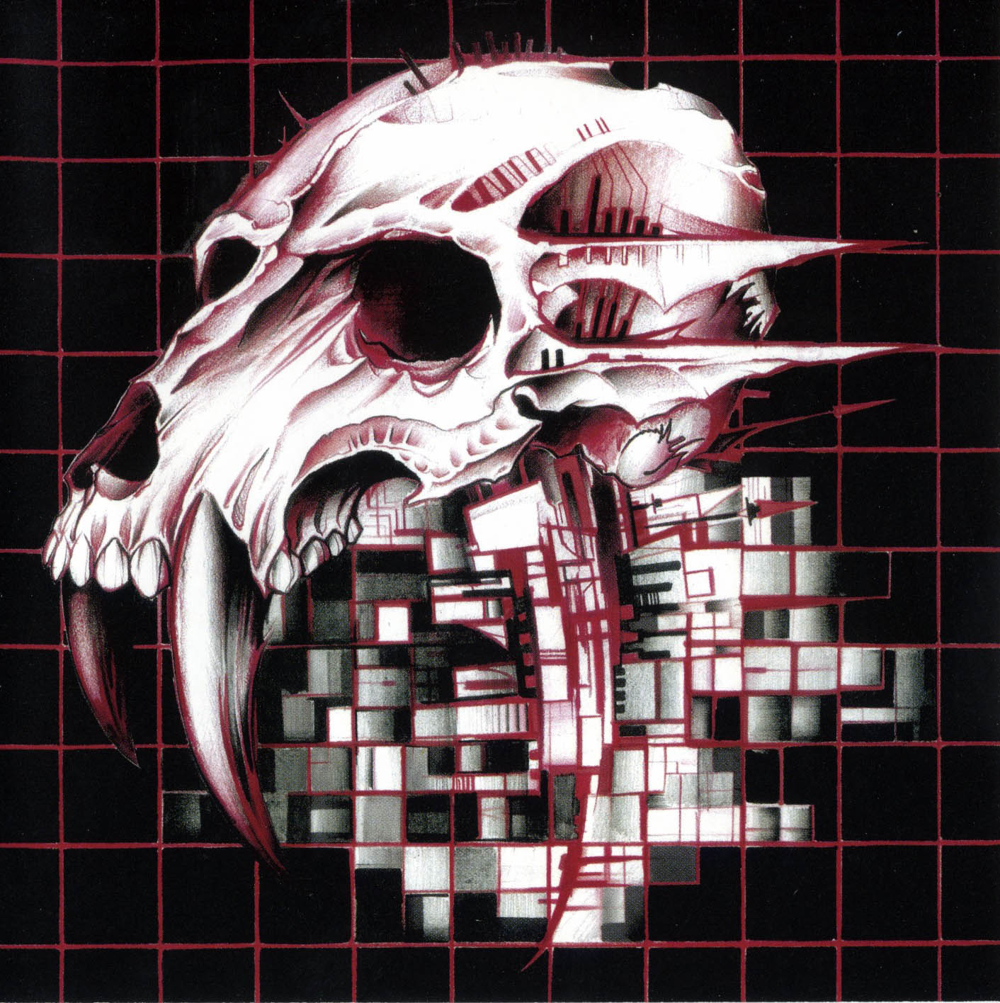
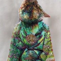
Me, in my ivory tower: Man, bandages as an art style really seems to be trendy amongst the wastelanders. I wonder why?
This comment actually made that choice click in my head, I’d never asked why that was before and kinda assumed it was to help protect the internals of a machine you couldn’t fix from the environment but really it’s more likely to be so you always have some bandages on hand (however sanitary)
oh, I figured it was just the ideal binding material for broken parts (e.g. limbs, rifle butts) whilst providing comfort and stretch/tightness control.
Now I’m no apocalypse expert, but I feel like a knife taped to some rebar doesn’t make for a very viable arrow, or at least not one that the pictured bow could fire
Edit: is that a curtain tassle they’ve used for fletching?
deleted by creator
I can’t comment on the other things, but the skull is obvious - it’s for drinking, and the top half functions like a lid you can flap on and off, like a German beer stein.
Memphis design for the colors and patterns, Y2K for the colorful translucent electronics, and Frutiger Aero for the GUIs.
I’m biased towards Y2K from the nostalgia, since those were the prime years of my childhood right before my teenage years kicked in.
But, I love the design of that time because of how obsessed with futurism everything was. It took the future chic look of the mid-late '60s and revamped it, taking that hype for the future- with the Space Race- bringing it back, and updating it for the Information Age.
It felt like we, as a society, had so much optimism for the world that was to come. So, if anything, I think that’s what I’m mostly nostalgic for. I was so excited to grow up in that world. Damn.
It felt like we, as a society, had so much optimism for the world that was to come. So, if anything, I think that’s what I’m mostly nostalgic for. I was so excited to grow up in that world. Damn.
As with anything regarding the past, there’s a lot of rose-tinted glasses going on. Be careful what you wish for
I would also argue we lived in a pre-9/11 world.
It us shocking how much the world changed in response for the sake of security and safety, and I know it’s a controversial take but the terrorists succeed in changing the world to their image.
Before: wow, this new thing is literally 4 times faster with a fuckload of features.
After : wow, this new thing allows 800 companies, fifty countries and 2 superpowers to spy on me at the same time and has 4 times the bloatware!
And all the alternatives do the same thing!
It felt like we, as a society, had so much optimism for the world that was to come. So, if anything, I think that’s what I’m mostly nostalgic for. I was so excited to grow up in that world. Damn.
We lived through the dawn of internet for the masses. It’s like seeing the start of the Iron Age. Historians in the future will wonder about proper like us and what went through our minds, seeing this huge inflection point in human history, and it’s not finished yet. The effects are still rippling.
You can make a telephone call now, with video, for free, to anywhere in the world. Even chatting to random strangers. The world has shrunk and we’re all getting to know each other and looking around and seeing what’s bullshit and what’s not. It’s slow progress but it’s happening.
US/Israel’s genocide live streamed is going to change the world order for example. The optimism was well placed.
I really thought that the internet would bring the 1st world and 3rd world together: e.g. I’d be able to videocall a farmer in India.
Instead our attention has been focused “upwards” towards a small minority of people, very few who interact with their followers meaningfully.
Apps that have been powering the gig economy (ridesharing, workrabbit, renting apps) have largely helped employers and landlords coordinate their efforts, and not helped the working class negotiate better conditions.
I’m not sure if optimism is warranted tbh
Me too, on the design, what I like about it is it wasn’t the ultra clean look futurism of the 1980s it was sort of collided with grunge.
Honestly? Any of them except the last one. My preference would be 2005-2015, but any of them is better than what came after. Late 2010s was alright, but around 2020 you can really tell UI designers got their marching orders.
It’s all so damn boring and lifeless. Rounded corners on literally everything for no reason other than trend chasing, wasted space and needless gaps between elements, white OR black - rarely anything else, lest it interfere with whatever systemwide adaptive coloring thing is running (even if there isn’t one), boring and lifeless icons/logos, an obsession with “clean” and “streamlined” that effectively equates to the removal of usability for aesthetics, etc. All of it copy and pasted to every single piece of software or app or site.
Its ironic you put Corporate Memphis images next to it in the 2015-2024 section, because that is effectively what this trend in design aesthetic will be remembered as.
Bland, lifeless, safe, focus-grouped garbage, implemented by companies that have reached a point where the innovation is dead, corporate consolidation has effectively destroyed any room for something new and original to enter the space, and the only thing they do anymore is trend chase. Even the slightest bit of originality or doing something different from the market leader may risk the potential loss of a sliver of shareholder profit, and that simply must never be done.
And I swear to God, if I hear one more focus group generated argument about how rounded corners are more inviting or human, I am going to break into your home, and personally change every last single doorway into a hobbit hole, and every window into a port hole.
The needless gaps are there for touchscreen optimization, even on things you never use a touchscreen on, like a desktop OS.
I think it’s to make desktop computing more approachable for people because smartphones are so ubiquitous nowadays and used by literally all age groups, so it makes a little bit of sense I guess.
Windows, pretty much the desktop OS still would like you to drag the screen up to start a login
Dude, you detected a mouse and keyboard during setup
… Can you turn my place into a Hobbit hole anyway?
Flat design is clinical depression in graphical form, a reflection of the contemporary existential/mental health crisis. It’s a societal cry for help, basically.
Or smartphones and high pixel density displays became the norm, and raster graphics don’t look good or scale well on them. Simple vector graphics are crisper on your screen, can be rendered via things like CSS, and can more easily scale to different resolutions and dimensions.
Apple’s skeuomorphic phase overlapped the Retina display era, though, so I don’t buy that explanation. Also, it’s nothing to do with raster vs. vector. The photos that we take with phone cameras are raster graphics, for example. They look great, and it’s because they’re high-resolution. High-res raster UI elements would look great, except then the versatile manipulation by CSS would not be possible. Vector graphics are very good at that.
But here’s the thing: Complex vector graphics exist, too. There were some pretty fancy PostScript graphics even back in the early 1990’s. With all the pixels that we have now, we could have good design instead of flat, if the developers bothered. But it seems we’ve internalized the feeling that we’re not worth the effort, aesthetics and color aren’t interesting, and life is a joyless slog. Which sounds and awful lot like clinical depression…
(Incidentally, odd that emoji aren’t flat design.)
(Incidentally, odd that emoji aren’t flat design.)
That actually depends on browser, app or OS that’s doing the render. Apple and Whatsapp use the same design, Android uses a slightly different one, Discord and Microsoft both use flat designs, but for Win11 it’s a different set
Interesting! I see what you mean, but while looking up Win11 emoji, I found this article from Microsoft about adding 3D design elements based on customer feedback. And, indeed, on my work computer (23H2), they’re not-quite-flat anymore.
Seems more a rejects of the flamboyance of the prior two generation which will certainly give it a different feel. It absolutely felt fresh at the time of inception.
I’m ready for post-flat design.
I’d be so happy for a desktop window manager that didn’t make all of the window borders grey-on-grey, and distinguish the active window by making the title text slightly-darker grey.
The irony is that you could go nuts with those color customizations on Windows 95-98-2000. Not to the point of active windows having different colors, but the title bar of the active window could be blue with red text, while inactives could be yellow with purple text, if you so wanted.
With Linux, you can customize your desktop until you pull your hair out.
Judging by the comments I think I must be alone in loathing the Frutiger Aero style of design, both now and at the time. So self-conscious, so fake-looking, so plasticky.
Much prefer the clean lines and flat colours of nowadays (although that’s not to say there aren’t issues - eg Google’s stupid icon design policies in the last few years)
I actually really like Metro, live tiles are criminally underused and imo it gets a lot of hate becauae of how microsoft pushed it in windows 8, but for a touch interface it’s clean and really nice to use. Loved the sideways laid out apps too on windows phone and windows rt, wp itself was actually really nice to use and I actually kinda miss my lumia 1020
Totally agreed on the Frutiger style, with Sharper Image being the pure, distilled form of it.
You know the worst part about flat design? Fucking “hamburger menu”. Fuck that shit.
The second worst part? “Text? Lol get real, old man!” Menus that don’t have text so I have to guess what the fucking icons mean on every different app/site.
Fontawesome and its consequences have been a disaster for web development.
Ditto on the no text part. That is an accessibility failure that’s way too widespread.
Sometimes I’m afraid to even push a button: does this delete my thing, or does it do some other irreversible change? Will I be able to tell what it did? Maybe it does something completely different, or maybe I’m lucky and it does in fact perform the action I’m looking for and which in my mind is a no-brainer to include?And it’s infected interpersonal communication too - people peppering their messages with emojis, even professional communications. It not only looks goofy, but is either redundant (when people just add the emoji together with the word it’s meant to represent - such a bizarre practice) or, worse, ambiguous when the pictogram replaces the word and the recipient(s) can’t make out what it depicts.
The most fun is when it’s a mix - the message contains some emojis with accompanying translation, some without.I prefer the hamburger menu way more.
But what I really prefer on desktop is the ribbon menu that MS uses in their office suite.
I was born and raised throughout the whole Memphis Design era, reluctantly tolerated the Y2K era, gained a little hope for humanity during the Frutiger Aero era, then subsequently lost all hope once the Flat Design era hit.
Every era is defined by the tools we had at hand during that process. While Memphis is basically pixel art, Y2K was defined by the gradient and mask tools on Photoshop, and Aero was a victim of skewmorphic design trends pushed by the commodity of 3D tooling. Flat design took prevalence because raster-based products felt weird when seen on retina displays.
I wonder how design will be affected when AI tools become the norm.
Everything will have extra fingers.
Seriously tho I think there will be a flight to intricacy.
Perhaps there will be a time in the future when we look back to when everything was “just” flat design. Meanwhile the UI will adapt the aesthetics of AI generated imagery which will be the new design thing then. Everything will look overly saturated but also a bit blurry, like AI generated landscapes. .
Or not. It depends on what data an AI will be fed with. Maybe it goes Frutiger Aero all over again (at least what the AI interpretation of Frutiger will be) since AI generators could be fed with the existing examples of such an era. We would have gone full circle.
Memphis was not pixel art.
Windows/BeOS/MacOS 6 to 9
If you hewed to the ops memes incorrect description, Memphis would have been the 80s and mid 90s. It’s interesting that the meme takes into consideration the concept of the long 70s but then just goes back to ten year distinctions. windows 3 (I assume you’re not talking about the early dos shell stuff because no one ever is and you put it squarely amongst the contemporaries of 95, but I’ll give the benefit of the doubt since we’re talking design language) went from ‘90-2003 (with ME) macos 7-9 spanned ‘91-2001 and beos was 95-2000.
It’s possible you aren’t sticking to that flawed understanding though, so let’s talk about design language and Memphis. You’re right that designs are informed by their tools and mediums. For Memphis group those tools were drafting paper and those mediums were chipboard and naugahide. Memphis group made couches and shelves, not software or digital art.
Now that’s not to say that only stuff from a specific cadre of Italian designers made during a short period is Memphis and everything else is sparkling crayon scribbles, only that the stuff we actually recognize as Memphis wasn’t pixel art by any measure.
Most of what is in the meme under Memphis isn’t even Memphis though, it’s pop art. I think the pants are a haring print…
With all that said, what about windows (were you talking about windows 3+?), macos 7-9 and beos would you say were sparkling crayon scribbles, pop art or genuinely drawing from the design language of the Memphis group?
I was taking about icon packs. I didn’t know about the Memphis designers, thanks for the nice write-up
It would be cool to have as much information about the icon design and window decorations of those oses as we have about the windows startup sound (look the making of that up sometime if you want to know the absolute heights of decadence software development hit and what Microsoft could do when they were really trying to compete with Apple).
Reading back, I was a jerk in my response to you, getting all “well actually” over a meme about 90s kids because it used the wrong name for the language of different designs.
Mea culpa. Im sorry.
all good! :pixelated-hug-emoji:
I don’t share the hate for flat design.
It’s cleaner than the others, simpler and less distracting. Easier on the eyes, too. It takes itself seriously and does so successfully imo (nice try, aero). It feels professional in a way all the previous eras don’t - they seem almost child-like by comparison.Modern design cultivates recognizable interactions by following conventions and common design language instead of goofy icons and high contrast colors. To me, modern software interfaces look like tools; the further you go back in time, the more they look like toys.
Old designs can be charming if executed well and in the right context. But I’m glad most things don’t look like they did 30 years ago.
I’m guessing many people associate older designs with the era they belonged to and the internet culture at the time. Perhaps rosy memories of younger days. Contrasting that with the overbearing corporate atmosphere of today and a general sense of a lack of authenticity in digital spaces everywhere, it’s not unreasonable to see flat design as sterile and soulless. But to me it just looks sleek and efficient.
I used to spend hours trying to customize UIs to my liking, nowadays pretty much everything just looks good out of the box.The one major gripe I have is with the tendency of modern designs to hide interactions behind deeply nested menu hopping. That one feels like an over-correction from the excessively cluttered menus of the past.
That and the fact that there’s way too many “settings” sections and you can never figure out which one has the thing you’re looking for.P S. The picture did flat design dirty by putting it on white background - we’re living in the era of dark mode!
Needs a few earlier movements, including Art Deco/jazz moderne, Bauhaus and midcentury modern/googie
And Art Nouveau!
y2k the transparent plastics were when electronic manufacturing took pride in its products. (though I much prefer modern user interfaces)
Aero: I liked the 2010-ish design best even though I was at least 20 at the time. I just found Memphis and y2k a little goofy. Win XP or this fish glass Mac are the worst for me.
Maybe someone who is too young to have lived in the 90s finds this novel, I don’t know.
Someone has written it here. There was at least some techno optimism left in 2012 or so and maybe that’s the time I am nostalgic for.
Not so much the 90s “because we had no phones” - then turn your phone off.
I started taking graphic design classes in the mid 2ks and the amount of my brain that has been squandered making everything look like shiny candy floating in a polished plastic void is disgusting.
Then I learned how to make everything look like it was badly spray stenciled and drug through a post industrial alley so I could really stick it to the man.
Woo, grunge!
Not so much the 90s “because we had no phones” - then turn your phone off. >
Whish it was that easy…
Frutiger Aero was when design peaked


